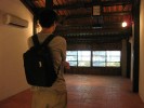
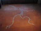
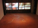
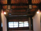
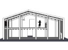
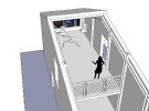
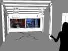
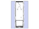
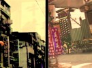
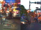
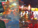
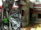
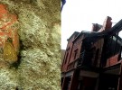
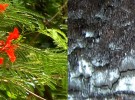
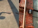
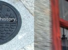
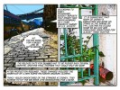
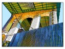
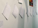
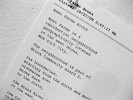
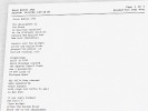
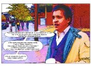
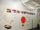
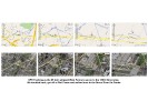
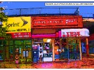
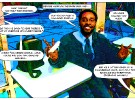
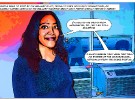
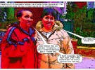
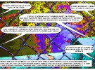
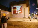
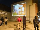
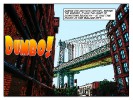
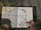
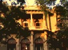
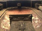
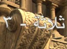
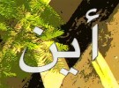
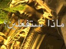
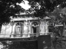
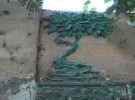
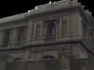
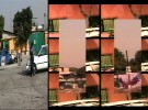
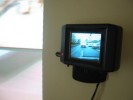
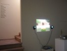
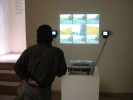
A 90 minute two channel video art installation, involving video projection on paper covered windows in a 100 plus year old Chinese warehouse building, Chalk floor drawing, signage, and lighting.
Presented as part of “Fusion Folks – Contemporary Art Exhibition” Organized by the Taipei Department of Cultural Affairs and planned by Taiwanese independent curator Mr. Sean C.S. Hu. 24 artists both Taiwanese and international, create works related to the Bo-Pi-Liao Historic Center, in the Wanhua District, creating closer ties between art, history, and local customs. Taipei City, Taiwan, from 8/29/09 to 11/01/09.
Installation Photos:
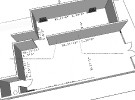
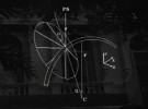
3D Model of Installation:
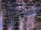
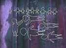
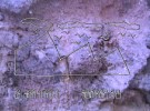
Video stills of both Channels:
Video Documentation:
[tubepress video=”I5ZJ6oMCwF0″ embeddedWidth=”610″ embeddedHeight=”380″ length=”true”]
Project Description:
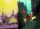
Mengjia-108, is a two channel video installation which explores the complex multicultural history of the Wanhua District, in Taipei City, a site of continuous human habitation along the Danshui River, for thousands of years. The title of the work refers to an ancient name for the area, along with the current postal code number. Â Wanhua’s long history and its contemporary status are thus juxtaposed in simultaneous existence. The work employs collage, video filter effects, and text overlay, to present images of past and present, as well as differing viewpoints, angles, and cultural perspectives.
Taiwan has been inhabited for perhaps tens of thousands of years, and the first people in the Taipei basin area arrived around 6000 years ago. These first peoples, or first nations, formed a robust river and seafaring culture. Both they and their language eventually spread all across the islands of South Asia and the Pacific, as far as New Zealand and even the land of the current United States of America. Due to lack of written records and in the absence of large scale architectural remains in long lasting materials, this monumental technological and cultural achievement has garnered little recognition.
Starting in the 1600’s successive waves of peoples including the Spanish, Dutch, Japanese and Han Chinese took control of all or parts of Taiwan, each leaving their mark on its cultural heritage. Throughout this history the Danshui River, and the Wanhua District area have played a major roll.
Wanhua has been an important harbor and trading site for thousands of years, and Mengjia-108 traces some of the disparate viewpoints and little known truths about the area. The Wanhua district has a proud and complex multicultural past, appreciation of which can serve as a guide to the shaping of its future.
Sun Dried Boys (Red Pepper Found Installation), Paul Clay, 2009
Presented in conjunction with (but not associated with), the 2009 Incheon Women Artists Biennale, Incheon Korea.
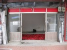
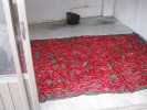
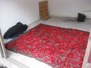
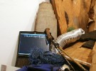
Multimedia work. Text description, digital photos of storefront installation with red paper-covered windows, television set, red plastic wash basin, flattened cardboard box, two black nets, drying red peppers. Dimensions variable.
Project Description:
Sun Dried Boys starts with a “found installation” or readymade in the form of something already existing, that looks for all the world like an art installation.
The space is photographed and then explicated at length, putting the “installation” in context within the contemporary art scene. The actual artwork consists of the photographs and the text in the form of a fictional “Project Description”. In one way such a work could simply be read as prankster art, but the real intent is to use the found space as a lens to view the art context of which the installation is supposedly a part.
Sun Dried Boys thus explores the social network around the 2009 Incheon Women Artists Biennale, acknowledges folk art and undervalued women’s practices, rips-off or riffs-on, the exploration of other artists work during the exhibit, and acknowledges the gendered power structures that still exist in society and in the contemporary art scene.
The artwork can be viewed at the following url:
http://sundriedboys.blogspot.com/
Two works from this series appeared in the group exhibit, “Anthropology: Revisited, Reinvented, Reinterpreted”, at Central Booking, Brooklyn, NY, November 2009. The work is intended to explore the Brooklyn neighborhood of Dumbo, and is available in two forms:
As individual 44″ x 66″, or 22″ x 33″ prints, archival ink, on acid free 100 percent cotton paper.
As individual images without text in the form of 38″ x 54″ archival ink prints on canvas.
Project Description:
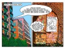
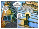
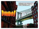
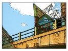
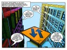
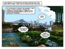
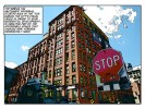
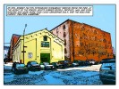
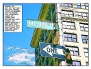
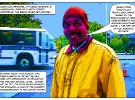
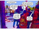
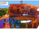
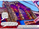
Dumbo Comic (Print Work) takes 30 Washington Street as its starting point, to explore Dumbo’s unique history, and its architectural and sociological development. The artworks, in the form of comics, take inspiration from the factories built along the East River waterfront, and from Robert Gair’s position in the end of the 19th century as an inventor involved in industrial printing, cardboard box manufacturing, and real estate.
The work includes reference to the idea of the “Walled City”, a nickname for Brooklyn in the time before the bridges, when there were so many warehouses along the river that it created the look of a walled fortress from the water side. The name can also be interpreted as a reference to the subsequent isolation that Dumbo suffered from, following the construction of the bridges and the Brooklyn Queens Expressway. The bridges and expressway not only made it hard to pass directly into Dumbo from the rest of Brooklyn, but also, because of the length of the exit-ways off of the bridge actually made all the Brooklyn/Manhattan traffic bypass Dumbo, traveling several stories above it. This (at first) tragic walling off, ultimately helped to preserve many of the historic qualities of the neighborhood which are valued today.
Dumbo, New York City’s 90th historic district, is bounded by John Street to the north, York Street to the south, Main Street to the west and Bridge Street to the east, and includes 91 buildings that reflect its industrial heritage. The Brooklyn waterfront region was one of the premier industrial areas in the United States, and at the turn of the 20th century, Brooklyn was the fourth-largest manufacturing center in the country.
Dumbo Comic (Print Work) looks at the historical development of this area through the use of line drawing, and the comic. The line is a simple yet powerful visual tool. Greek legend has it that the first drawing originated from someone using a stick to copy shadows in the sand, and line drawing has long functioned to allow a kind of caricature, or portrait of a person or thing. Comics use a simplified, or iconic visual language to explain complex ideas and narrative structures – a kind of “amplification through simplification”. The form tends to be democratic in nature, and readily accessible to a broad spectrum of society.
The origins of the modern single frame political cartoon can be traced to Britain in the 1800’s and is distinguished by the use of caricature. Throughout much of the United States’ history, political cartoons have held a prominent place. In the Civil War era, Thomas Nast invented the “Donkey” and “Elephant” that remain today the standard signs for the Democratic and Republican parties. They help us focus on the metaphors used in societal discourses.
Comics (or multi-frame cartoons) developed in the late 19th and early 20th century, alongside the similar forms of film and animation. The history and development of comics is directly linked to the development of 19th century manufacturing, to newspapers, and to the re-invention of printing as a large-scale industrial process. Robert Gair was a part of this movement, and the development of serial frame comics was happening at exactly the same time he was building “Gairville” in what is now Dumbo. Further, Gair’s newly developed process of industrial printing on cardboard, and his industrial production system for cardboard boxes was likely inspired by newspaper industrialization. Gair’s former factory was located in Manhattan near the Puck building, an historic area in the development of industrial printing.
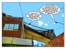
Dumbo is a place of outsized architecture. Everything is at the scale of elephants or super heroes. In addition to its rich history, it is currently the site of some of the most intense gentrification in New York City. In Dumbo Comic (Print Work) the neighborhood and the buildings themselves are characterized through the visual language of the comic book, in order to provoke thought on issues of urban planning, quality of life, and the visual impact of the street level built environment. The project acknowledges the scale of the area and the special place which architecture and development holds here.
Methods:
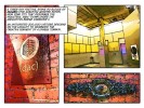
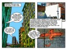
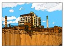
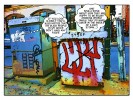
Dumbo Comic (Print Work) consists of two series of works with images starting from 12 megapixel digital stills shot on the streets of Dumbo. These images are then individually run through a variety of different types of desktop printing software and extensively reworked and elaborated, resulting in a set of “Technicolor” schemed cartoon prints, capturing architectural detail, and the street level build environment.
Text has been added by doing a Google search for the word “Dumbo” and culling bits of text and actual quotes from the search results. Part of the byproduct of this method is that elements of text treating the 1941 Walt Disney Animated feature by the same name also make their way into the work, serendipitously adding to critique of issues within the neighborhood.
Working with the form of the comic, this project attempts to provoke thought on issues of urban planing, quality of life, and visual impact of the street level built environment.
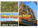
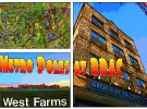
Presented at the Bronx River Art Center as part of the goup exhibit Metro Poles, Art in Action, a curatorial collaboration between tne Jamaica Center for Arts & Learning (JCAL), the Bronx River Art Centre (BRAC), the Asian American Arts Center (AAAC), and the Maiden Lane Exhibition Space. The work is intended to explore the Bronx, the neighborhood of West Farms, the area’s relationship to the gallery, and the premise of the exhibit.
Here is the comic, in its entirety:
Â
Project Description:
Because this group exhibit is intended to focus on process, blur lines between artworks, and reduce the primacy of the individual artist in favor of a loose integrated net of creativity that blankets the entire gallery – even the act of writing a statement about the individual work could be seen to detract from the exhibit’s mission.
What follows is therefore, not a concise statement but rather a description of participation.
In the spring of this year I was invited by Jose Ruiz, curator of Bronx River Art Centre (BRAC) and Heng-Gil Han, curator for the Jamaica Center for Arts & Learning (JCAL), to submit responses to a set of questions.
They were asking a variety of artists to respond to the idea of an exhibit where artists would make work in a gallery setting and then have it subsequently altered by others. Among the questions asked were: “What contribution can you make to this unconventional exhibition?”, “Can you allow other artists to revise your installation?”, and “Who would be other artists that you would like to invite to the exhibition for the revision and collective art-making?”
The resulting exhibit: “Metro Poles, Art in Action”, is a curatorial collaboration with Jamaica Center for Arts & Learning (JCAL), the Bronx River Art Centre (BRAC), the Asian American Arts Center (AAAC), and the Maiden Lane Exhibition Space.
Â
Among the things I wrote back in my initial response were the following:
“I will photograph in or near the display space – i.e. nearby buildings, back yards, whatever. The available views will function as a filter or organizing principle. This will become the target of research.”
“I will then go out on the street and find anecdotal information from passersby (as well as from people employed by the art institution) regarding who lives there, what business is conducted, what events have been witnessed etc.”
“In a third step I will do further historical research about the visually identified locations on-line. I will then make a collage from the various information materials, printed with ink jet, in a variety of sizes and textures of paper and post the information on the galley walls, like fliers or even gorilla-style like paper street art.”
“All this material, both the physical printing on paper and the conceptual structure surrounding it would then be available as raw materials to use by subsequent artists in any way they see fit. I would simply hope they might function as a launching off point of interest in the creative process going forward.”
I also invited artists Chang-Jin Lee, Marcy Brafman, and Ã…sa Elzén to be “team members” for our group, one of seven groups to work in the space.
For my part I ultimately adopted six strategies, relating to my initial proposal that were designed to explore the Bronx, West Farms, (the neighborhood where BRAC is located), and the area’s relationship to the gallery and the mission of the exhibit.
Â
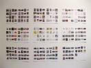
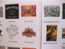
Strategy One: Gathering images based on a net search for the word “Bronx”
This was a way to begin to understand the visual history in relation to what people have recorded on the internet, about the Bronx.
This doesn’t constitute a comprehensive compendium of visual material for two reasons. First, many things visual known and recorded were done by people prior to the world wide web and those people tend to be less connected, and thus fail to get their visual info recorded to a web readable format, and posted. As a result, much of this human visual archive is missing from a current search.
Secondly, visual searches are still in the dark ages of technology, or in their infancy. Most digital visual images must be “tagged” with text either in their name, metadata (invisible information attached to the digital visual file) or through some similar structure, in order to show up in a search. Smart search engines may also give some weight to images on web pages titled with the search term or in which text containing the term is laid out in close proximity to an image, but this is obviously a tricky mix to accomplish successfully and thus leaves out much of the valuable information that actually has been posted, but hasn’t yet been tagged.
There are algorithms (the most effective of which are currently mostly available only to large corporations), which can search for the actual visual elements of an image, or its genuine “mediatic criteria”, such as color, luminance etc. These can find an image no matter what it has been tagged, but even these currently cutting edge technologies can only look for an image once they already have a base image to compare, so they can find close matches, but only to images they already know about.
All this means that right now, doing a visual search on the Bronx yields a strikingly limited set of results. Nonetheless, it begins to tell some stories about what people, corporations, and organizations valued enough to tag and post.
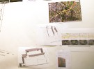
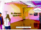
To display I printed a selection of the results, 16 images to a page, on 8 1/2″ x 11″ ink jet paper, along with the name of each file displayed below it, on 18 pages, and taped them to the gallery wall, much as I might do in my studio.
Â
Strategy Two: Download text related to the history of the Bronx and the neighborhood of West Farms.
I chose 9 of the most compelling texts among many dozen I had saved, formatted them in a formal structure designed to be reminiscent of poems, and pinned these to the wall.
In most cases, the written work was stripped to ASCII text, every comma was removed and converted to a carriage return, and every period was removed and converted to two carriage returns, to create text block separations, and finally the entire text was hard wrapped to 35 characters, to produce short phrases. I did a bit of clean up for readability, printed the texts and push pinned them to the wall.
The texts cover a range of subjects from how the Bronx got its name to the demographics and transportation structure of West Farms.
Â
Strategy Three: Non-linear story telling, through the use of Comics
I have little connection to the world of comics, and never read them as a kid. I came at the format from video art, looking for a way to accomplish similar results, but in a form that allows the viewer more leeway in the amount of time they devote to the process. Still images allow more immediate intake.
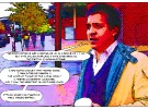
The text for the comics comes not from the net research, (as is the case with many of my past projects) but from things that people actually said to me. This is combined with photos that are digitally reworked to become a sort of cartoon or comic book, printed in non archival inks on 13″x19″ mat ink jet paper and pinned to the gallery wall. Various walks as well as interviews with gallery staff and local patrons provided the materials. Some responses also came from emailed questions to specific participants.
Â
Strategy Four: Mapping and modeling the neighborhood
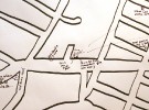
Using a data projector I traced a street map of the entire neighborhood of west Farms onto a big 8′ x 10′ piece of paper and then cut the map roughly out of the center of it and pinned it to the gallery wall. I then recorded impressions about the neighborhood and where I met the people who became part of the comic.
Using a ground plan of the BRAC gallery I made a quick 3D computer model of the space and recorded where the first elements of the project were placed in the space.
I photographed part of an MTA subway map with my phone, showing West Farms, then emailed it to BRAC while on route to the gallery. Once there, I had them print the email with the map and posted it with the other mapping elements. This related to the personal nature of the work and to the idea of the documentarist or participant-observer including information about themselves within the surroundings being documented.
In the same vein, I downloaded an app to my mobile phone allowing me to track my GPS location and record in real time to a version of Google Maps. I posted a printout of one particular tracking event documenting my crossing of the entire length of West Farms, when the MTA train I was taking to the gallery went express and passed my intended stop. I thought, “This must happen all the time, when you live in West Farms.”
Â
Strategy Five: Incorporation with other works.
I placed an old laptop within an arrangement of refuse, which another artist had put together. The computer displays the text from the “poems” I had created from the earlier documentary material, and so creates another avenue of historical communication, and also relates to the work it is situated in by referring to the problem of e-waist.
I Added text comments to artist Marcy Brafman’s work, in the areas where the public is invited to participate.
I filled in several blanks in mad libs left on the walls by another artist.
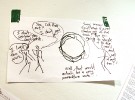
I created a stick figure comic from one of the many works on paper strewn throughout the gallery, referring to both that work and other art in the gallery, using text from a visitor as inspiration, and which questions what constitutes art.
Â
Strategy 6: Blog and website. I created a blog to document my own progress so that other artists could see what was happening, and am also posting materials to this site.
http://west-farms-studio.blogspot.com/
Single channel, framed, wall mounted, 4 second loop, video work. 8 1/2″h x 11 1/2″w x 1 1/2″d Presented at the Heskin Contemporary gallery as part of the group exhibit Meet Cute curated by Elizabeth Heskin & Marcy Brafman.
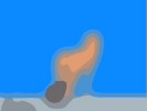
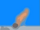
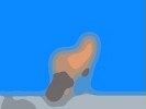
Eromenia, explores contemporary East/West cultural constructions of sex, commodification, and idealization, in a way that embraces nostalgia and at the same time questions how much value people can actually receive from delusions of eros.
Â
Photo Documentation:
Â
Video Documentation:
[tubepress mode=’playlist’, playlistValue=’259B7AED291DCF58′]
Project Description:
The piece is made from advertisements for software designed to create “sexy” soft-core porn images which pop up on a computer’s desktop as a kind of “pleasant distraction”. In the case of Eromenia, the image is captured and memorialized in a small wooden frame designed to suggest the kind of keepsake photographs typically found in a middle aged Western male’s den or home office.
The image, made from a gif of only a very small number of pixels, has been further smoothed and simplified to erase all recognition of the original form, yet the movement is still utterly clear – some kind of fetching, erotic rocking or swaying.
The title of the work is intended to sound like the name of a Greek Goddess or Muse such as Eidyia, Ilithyia, Eunomia, or Urania and to evoke Erato the Muse of love and erotic poetry.
It is also intended to evoke two other notions: the late 20th century Japanese phenomenon of “Eromanga” and the long-standing Western clinical notion of “Erotomania.”
“Eromanga” is also referred to as “Hentai”, the Japanese word originally meaning “metamorphosis” or “abnormality”. In Japan “hentai” has a strong negative connotation, and is commonly used to mean “sexually perverted”. The term is used as slang for sexually explicit or pornographic pop culture imagery. Manga, the Japanese word for comics, along with the prefix “ero” (erotic) creates a wordplay, indicating perverted comics or animation.
Mania is a severe medical condition characterized by extremely elevated mood, energy, and unusual thought patterns. The experience of mania is often quite unpleasant and sometimes disturbing, and may lead to impulsive behavior, frustration, and decreased ability to communicate. Severe forms of mania cause impairment.
Erotomania is a form of the disorder in which a person holds a delusional belief that another person, usually of a higher social status or greater beauty or sexual attractiveness, is in love with them. Though its use continues into the present, early references to the condition can be found in the work of Hippocrates and Plutarch.
Eromenia, thus explores contemporary East/West cultural constructions of sex, commodification, and idealization, in a way that embraces nostalgia and at the same time questions how much value people can actually receive from delusions of eros.
Presented at theDumbo Art Center (dac) Art under the bridge festival, Brooklyn, NY, 2006. The work is intended to explore the Brooklyn the neighborhood of dumbo.
Project Description:
Single channel, 18 Frame, 600 x 800 pixel, RGB data projection work
Presented as part of the d.u.m.b.o. arts center (dac) 10th annual art under the bridge festival, 2006. Projected on the blank three story wall in the small parking lot on the South West corner of Jay and Water Street, Dumbo, Brooklyn.
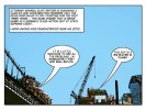
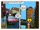
Dumbo is a place of outsized architecture. Everything is at the scale of elephants or super heroes. It is also has a rich history, and is currently the site of some of the most intense gentrification in New York City. This project acknowledges the scale of the area (and the special place which architecture holds here) by working with the structure of the comic book and the giant billboard.
Methods:
All images started out as 12 megapixel digital still images shot on the streets of dumbo, capturing architectural detail, and the street level build environment. Text was added by doing a Google search for the word “dumbo” and culling bits of text and actual quotes from the search results.
By working with the idea of the comic and the billboard, this project attempts to provoke thought on issues of urban planing, quality of life, and visual impact of the street level built environment.
Presented at Maxwell Fine Art, Peekskill, New York, NY, is a single channel video work which explores the fundamental mediatic qualities inherent in the superimposing of text on video.
Video Stills:
Â
Video Excerpt:
[tubepress mode=’playlist’, playlistValue=’AAF040E7031AA4A0′]
Â
Project Description:
Writing By Cutting is a single channel video work which explores the fundamental mediatic qualities inherent in the superimposing of text on video.
The technical processes of the “matte generator” and “downstream key ” (or DSK), are a means of producing a flat solid-color output which is often used to superimpose or “key” text on top of a video image. In this case what is being written over the video is not text itself but something with visually similar qualities.
The DSK is commonly employed in video industrials during title sequences and show openers, bumpers and interstitials, as well as in corporate video presentations whenever words are needed. Now being eclipsed by motion graphics as the favored mode of text presentation, this ubiquitous visual event has become cliché.
In early film work black mattes were cut by hand and placed over sections of the image to allow compositing. Today av mixers generate simple mattes on the fly, cutting out parts of the image and replacing it with text. Writing by Cutting takes this common yet ephemeral video occurrence and strips it down to essentials, as a means to make its fundamental structure apparent.
Created using an industrial audio/video mixing console and with no video content or text source material whatsoever, the “program” output of the mixer is redirected back into one of the input channels to create a delayed feedback loop. By keying a matte over the feedback and carefully riding the luminance levels, semi persistent lines can be inscribed over the channel below. Newly recorded material is written to the foreground as the older fades into the background giving an illusion of multiple planes of depth.
The process itself is done live, by hand, and is delicate to achieve and to control. The “writing” process reveals fundamental mediatic qualities inherent in video imagery itself, and explores the visual meanings embedded within these structures.
Palace of Contemplation, 5 Sunsets and 5 Dawns, a 20 minute DVD video art work presented at the Cairo Opera House Art Gallery, Cairo, Egypt, uses the concept of the book to explore notions of learning, and uses the image of a book to create a “frame story†which “bookends†the piece. It is a poetic evocation of the Abandoned Halim Palace in Cairo, as well as a meditation on the whole life cycle of the building and its meaning in people’s lives, both throughout its current history, and into envisioned possible futures.
Video Stills:
Video Excerpt:
(Note: The first 49 seconds of the piece are completely silent. Best watched in High Quality – Click video once to play, then after video begins click the “HQ” icon on the lower right. Video will restart in High Quality.)
[tubepress]
Project Description:
In 2005, with the help of friends, I came across an abandoned palace which sits right in the heart of Cairo, in the Ismailia district, a poor neighborhood of auto chop shops and car mechanics.
It was built by Prince Saiid Halim Pasha, a grandson of Mohammed Ali (Wali of Egypt for the Ottoman Empire, and regarded as the “founder of modern Egypt”). Saiid Halim who became the Grand Vizier of the Ottoman Empire, built the grand red marble town house for his wife Amina Indji Toussoun, herself a great-granddaughter of Mohammed Ali. History has it that Prince Halim’s father could have been the ruler of all Egypt had it not been for his highly ambitious nephew.
On the first day of Ramadan I was able to arrange a tour of the place. I was taken both by the architecture and by its history, it having been a school first for elites, and in the end for wayward youth, before becoming totally abandoned. Some people had the idea of turning it into a contemporary art museum, but the neighborhood it resides in was beginning to show the signs of gentrification, and others wished to see it torn down or converted to luxury living space.
Several days later I came back with a video camera to document the building with an eye toward creating an artwork, but by this time the mood had already changed. Arriving at the front gates, I was met by guards who informed me that for safety’s sake, no one was allowed to enter. The artwork about this piece of architecture had already begun forming in my mind. Denied access, I decided simply to walk the perimeter and record a single circumambulation of the space.
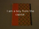
The work uses the concept of the book to explore notions of learning, and uses the image of a book to create a “frame story” which “bookends” the piece. The video begins with the image of a grammar school book from the actual site, and tells the brief story of a boy from the school and the powerful Egyptian ruler who built the palace for his wife. Text about the boy comes not from the book pictured, but rather from an open source wiki book intended to teach Arabic to English speakers, and this same text appears later in the video in Arabic as well.
A little like the 1939 feature film “The Wizard of Oz” in which the “dream sequence” (in color) is the most vivid part, in “Palace…” sound and active movement only occur during the circumambulation stage, representing an imaginary five year journey into the future.
The Buraq was a kind of mythical winged horse and the traditional lightning steed of the prophets for dream journeys. Here in this neighborhood of garages and auto mechanics, the Buraq is replaced by the sound of a mini van starting up at the beginning of the journey, then driving away at the end.
Egypt is primarily Sunni, among whom fasting during Ramadan is considered one of the Five Pillars of Islam: fasting, charity, prayer five times a day, proclamation of faith, and making a pilgrimage to Mecca. “Palace…” involves a kind of pilgrimage around the space, and as Ramadan begins at dawn and ends with sunset, (thus completing the holy month until the following year,) the phrase “Five Sunsets and Five Dawns” actually indicates a passage of five years.
The number five appears in the work in a number of other ways as well, including a hand drawn chart showing the four seasons plus the month of Ramadan, the screen split into quadrants with a full screen layer above, and the overlay in the video of five kinds of language – namely Arabic, English, ancient Egyptian, the language of mathematics, and of symbols drawn by children.
As the journey circling the building begins, the viewer is asked to imagine what the Halim Palace might be, five Ramadans into the future. Montaged over the video documenting the exterior are the drawings charting Ramadan to 2010 as it clocks around the seasons, tracings of actual children’s drawings left behind at the site from the days of the school, mathematical symbols relating to light and learning, as well as parts of an ancient Egyptian tale in hieroglyphics, used to educate scribes. Elements of text in the video are in both English and Arabic, and include common Arabic proverbs relating to the palace, such as “Seek education from the cradle to the grave.”
The sound track is composed of audio from popular radio stations recorded in cabs in downtown Cairo, ambient street noise from the circling walk, and traditional Zar music, an ancient Egyptian ritual healing music, recorded live in a studio on the outskirts of the city.
The piece is a poetic evocation of my personal experience of the physical space, as well as a meditation on the whole life cycle of the building and its meaning in peoples lives, both throughout its current history, and into envisioned possible futures.
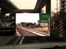
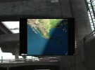
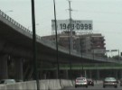
A one hour long, two channel, three screen, dvd video installation. Created through a live video mix performance, it deals with street level architecture, globalization, and the meaning of work, home, and place, and was presented in the group show Une promesse de malheur, curated by Edgar Orlaineta, at GAM – GalerÃa de Arte Mexicano.
Video stills and photo documentation of the installation:
Â
Video Excerpt [4min, 53sec]:
Note: Best watched in High Quality – Click video once to play, then after video begins click the “HQ” icon on the lower right. Video will restart in High Quality.
[tubepress mode=’playlist’, playlistValue=’2802BFB8249A419F’]
Project Description:
The first part of the title refers to two cities, New York (NY) and Ciudad de México, Distrito Federal (DF), and the second part translates in English as “going to work, going home.” The piece is created from footage shot in both cities, recorded by the artist and a range of people who work at the GalerÃa de Arte Mexicano, focusing solely on traveling to work and traveling home. The video footage is mixed with satellite photography, maps, and various forms of business and other data, suggesting the socioeconomic as well as geographic connections between the two cities.
As Mexico City grows, working people move further and further into the expanding periphery and one can see the infrastructure of highways and services struggling to keep pace. This same overflow leads some to travel North and there has been a huge new influx of laborers into the New York City area, helping power that city’s economy from the ground up. The energy of this expansion is echoed in the hard driving and rapidly changing “music video style” imagery used in the artwork.
NYDF Concentrates on the activity of going to work and going home, cars honking, drivers cursing, changing radio stations, traffic jams, and an almost comedic sense of being overwhelmed by the journey. Yet despite the “club visuals” style, the piece ends with arriving home and the simple pleasures of children and family. That is, until the epilogue, in which the whole thing starts all over again.
Advertising, shopping, architectural development, corporate media – these are complex cultural processes that are colonizing and overtaking public space. A kind of Global and urban sprawl is creating a hither-to-unimagined world that we now must function in on a daily basis. This encroachment endangers the creative environment needed by every individual. The urban street-scape is being converted more and more to a site of corporate bombardment and endless counterproductive transport, rather than community interaction.
NYDF represents an attempt to look at what we have made around us, to wake up to our own participation, and, at the same time, to honor the beauty and immediacy of individual lived experience in the present moment.
Contributors to the project: Lourdes MarroquÃn Hernández Edgar Orlaineta Mariana Pérez Amor Faustino Serna Nuñez.
The Triumph of Romanticism
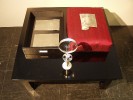
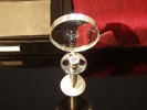
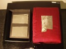
A sculptural meditation on the physical nature of books and printing in the contemporary electronic era, composed of fragments of printing plates, document box, pillow, table, flashlight, magnifying glass, and statement. The project description or statement, a part of the artwork itself, is intended to be displayed along with the other elements. It comments both on romanticism generally, and specifically on the very notion of “text” and the idea of “books” in our current digital era. It contains within it a story of the artist in his garret, creating the work as he “begins feverishly to cut the pages one by one…”
24″x36″x36″ at Maxwell Fine Art, Peekskill, New York
Â
Project Description:
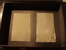
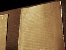
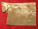
“The Triumph of Romanticism” consists of an archival quality lined leather bound document box, a rectangular Indian red silk display pillow of exactly the same dimensions as the box, a chrome and ceramic stand holding a silver flashlight and magnifying glass, a low square traditional oriental table on which all the elements reside, and 58 fragments of hydrophilic offset lithography plates originally used in the printing of an old literary survey book containing a chapter entitled “Triumph of Romanticism.”
The plates were discovered during demo of a 2000 square foot loft in Williamsburg Brooklyn that was being rehabbed. The plates had been used as a building material, forming the ceiling area around a large skylight.
The story seems hardly plausible, but it is entirely true. Picture if you will, the artist in his garret. There is no heat, not even a radiator. There is no electricity. Water is pouring in from around the edges of the skylight above. A shaft of cold winter light bathes the room. In a desperate attempt to discover the source and staunch the flood, and working from instinct rather than reason, the artist begins ripping away the ceiling around the skylight.
Suddenly a discovery is made, on the reverse side of the dingy white metal ceiling flashing is the text of a work. The very ceiling itself – is a book! In his ecstatic and frenzied state, the Sturm und Drang of the artists dreary existence is forgotten. Seizing a pair of tin snips, and drenched in the icy water pouring down around him, the artist begins feverishly to cut the pages one by one from the ceiling.
For the printed work, offset lithography long ago replaced typesetting as the favored method for making books. Today this method itself is being replaced by print-on-demand from ink jet printers, reading on line, and ebooks. Unlike letterpress, offset printing does not involve raised or etched surfaces. Rather, metal plates are chemically treated to retain water in areas that are to be blank space, and reject water but attract grease or oily ink in areas of text. The plates pass the ink to a rubber surface where it is temporarily offset in reverse, and then to the paper. The result not only involves very little wear and thus allows for large print runs, but it also coincidentally means that the shiny text on the surface of the plates is not reversed and thus perfectly legible, just as regular pages in a book.
“The Triumph of Romanticism” evokes both the 19th century love of archiving, and the impression of a lost antiquity displayed in a cabinet of curiosities. The book preserved as ancient or exotic artifact.
This depiction is reenforced by the changes in society relating to text. It is not uncommon for people these days to consider digital text (where the computer understands each character as individually editable) as “actual” text and printed pages as a kind of archaic picture or snapshot, and not the thing itself. The printed page as dumb object, both annoying and of little use. A kind of ghost or residue of the actual text.
Yet this stupid physical object text may soon be all we have left to preserve text with. A host of systems for Digital Rights Management or DRM are being trotted out by corporations attempting to put a strangle hold on the free flow of information caused by the invention of the internet. The argument they make is they are simply trying to protect the copyright so that people can receive just compensation, but the threat to our freedom to read, teach, and preserve books is so great that the American Library Association, in its Office for Information Technology Policy Brief “Digital Rights Management: A Guide for Librarians” outlines at least six key areas of concern where DRM could fundamentally harm the preservation of cultural knowledge for the future. This is because it involves encoding the digital information in such a way that even though you may be in possession of the digital book,the DRM controller decides what and how you can and can not read.
Yet writing is by nature an encoding, and thus always requires some device to decode it – whether a computer program, or simply vision, speech, and language. Cory Doctorow in his brilliant and impressive critique of DRM from the June 17, 2004, “Microsoft Research DRM talk” says “Paper books are the packaging that books come in.” Though he makes light of “how nice a book looks on your bookcase and how nice it smells” and seems almost dismissive of paper books as trash, this statement regarding books and packaging contains a vital notion. The book is the ideas encoded in the text, no matter what form the text is delivered in.
And so we finally circle back around to the book in the ceiling and the artwork made from it. In the electronic text age, here is the supposed “Triumph of Romanticism” – some loose fragments of metal left over from the dark ages of printing. Clearly there is no triumph. This does not constitute the effective preservation of 19th century literature, nor does it solve the problem of how to preserve books, in general, in the face of the overwhelming corporate and national control of media in the coming generation of the electronic age.
In the “The Triumph of Romanticism” the two forgotten art forms of books and found art come together in some kind of pale continued existence. The display, stuck in a maudlin reverence and elegiac longing for the past, strives mightily to achieve its goal, and fails. Yet what is this but a kind of reencoding and presentation of a lost set of ideals – the very essence of romanticism?
